
DESIGN-LED ECOMMERCE · CONCEPT CASE STUDY
Orren
Objects
Objects worth leaving out.
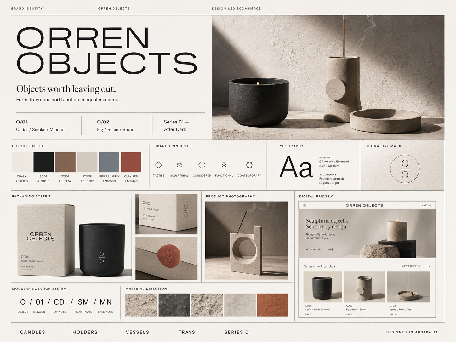
A design-led ecommerce concept repositioning a home-fragrance business as a small design house producing functional objects for the home.
Orren Objects is a fictional Australian design brand created as a concept case study. It exists to demonstrate NWD’s approach to product-led brands — not to represent a real client.
- Project type
- Concept project
- Sector
- Design-led ecommerce / home objects
- Market
- Australia
- Engagement
- Brand strategy, visual identity, packaging, ecommerce, launch campaign
- Core idea
- Objects worth leaving out.
01 — The situation
The product and the brand told different stories.
Orren began as a direct-to-consumer home fragrance business. The products had evolved — forms more sculptural, materials more considered, pricing above the mass market — but the brand hadn’t kept pace.
Photography shifted from collection to collection. Packaging was functional but inconsistent. The website was visually clean yet still read like a standard ecommerce template with a brand placed on top of it.
The product quality and the brand experience were telling two different stories.
02 — The diagnosis
Orren had never defined what kind of brand it wanted to become.
The deeper issue wasn’t packaging or photography. Orren had never clearly defined what kind of brand it wanted to become, and by default it was being presented as a candle company.
The products themselves suggested something more interesting. They were objects first. Fragrance was one part of their function.
The strategic opportunity was to move Orren away from conventional home-fragrance branding and reposition it as a small design house producing functional objects for the home.
03 — Strategic positioning
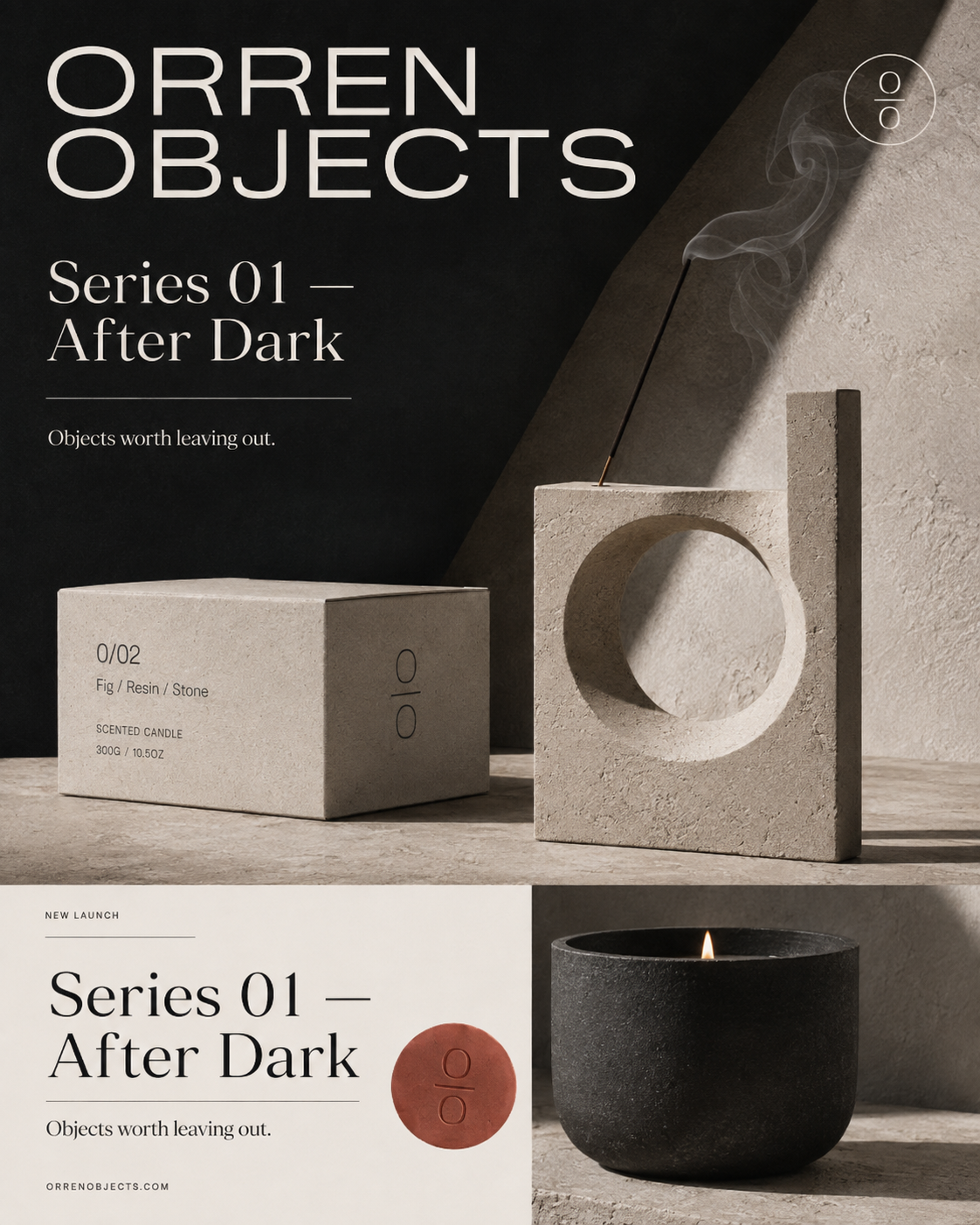
Objects worth leaving out.
The central idea is that everyday functional products can also contribute to the visual environment they occupy.
That became the brand proposition:
Objects worth leaving out.
The supporting line — form, fragrance and function in equal measure — shifts the buying conversation away from fragrance alone.
Customers aren’t only choosing a scent. They’re choosing an object.
04 — Visual identity
Material, quiet and considered.
The identity deliberately avoids the visual language most premium candle brands reach for: no handwritten marks, no botanical drawings, no soft blush palette, no decorative fragrance illustration.
The primary wordmark — ORREN OBJECTS — is set in a wide contemporary sans serif, used confidently and often at scale.
A secondary mark reduces the identity to two circular forms separated by a fine rule: simple enough to emboss, engrave or apply directly to a product surface.
The colour palette comes from materials rather than lifestyle trends: chalk, soot, oxide, stone, mineral grey and clay red.
05 — Naming system
A modular notation system.
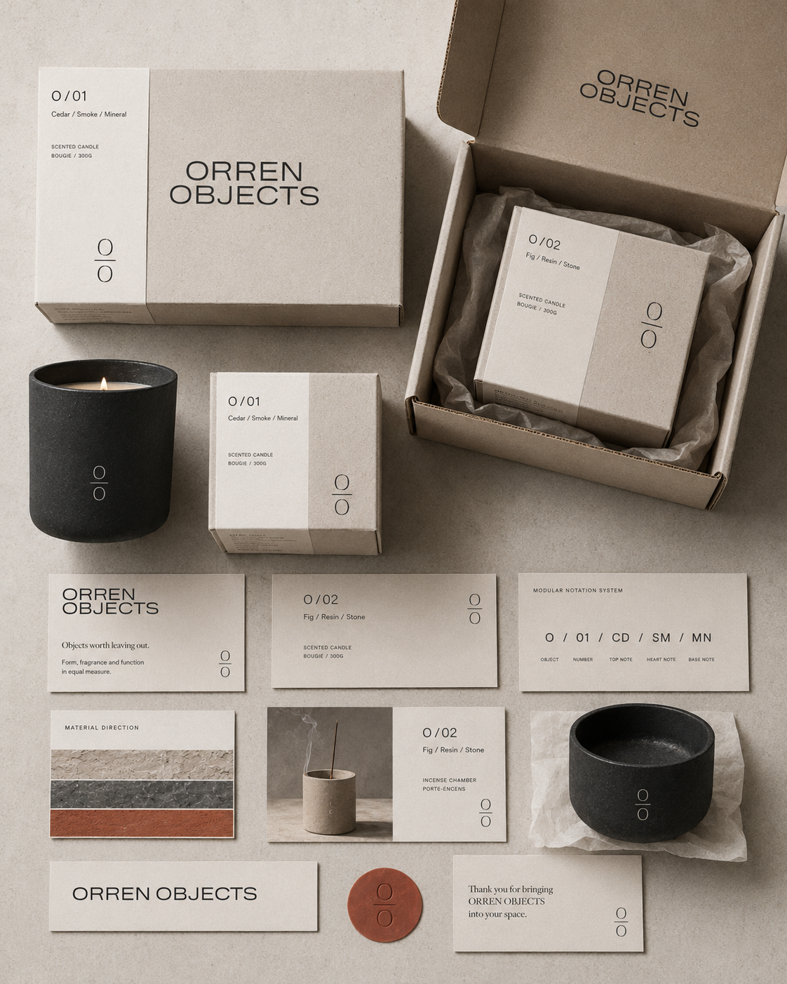
Every product belongs to a modular notation system rather than relying on descriptive names alone.
Examples include:
O/01 Cedar / Smoke / Mineral
O/02 Fig / Resin / Stone
O/03 Vetiver / Moss / Clay
The system runs consistently across packaging, ecommerce, product cards, labels and launch graphics.
06 — Ecommerce
A digital product catalogue.
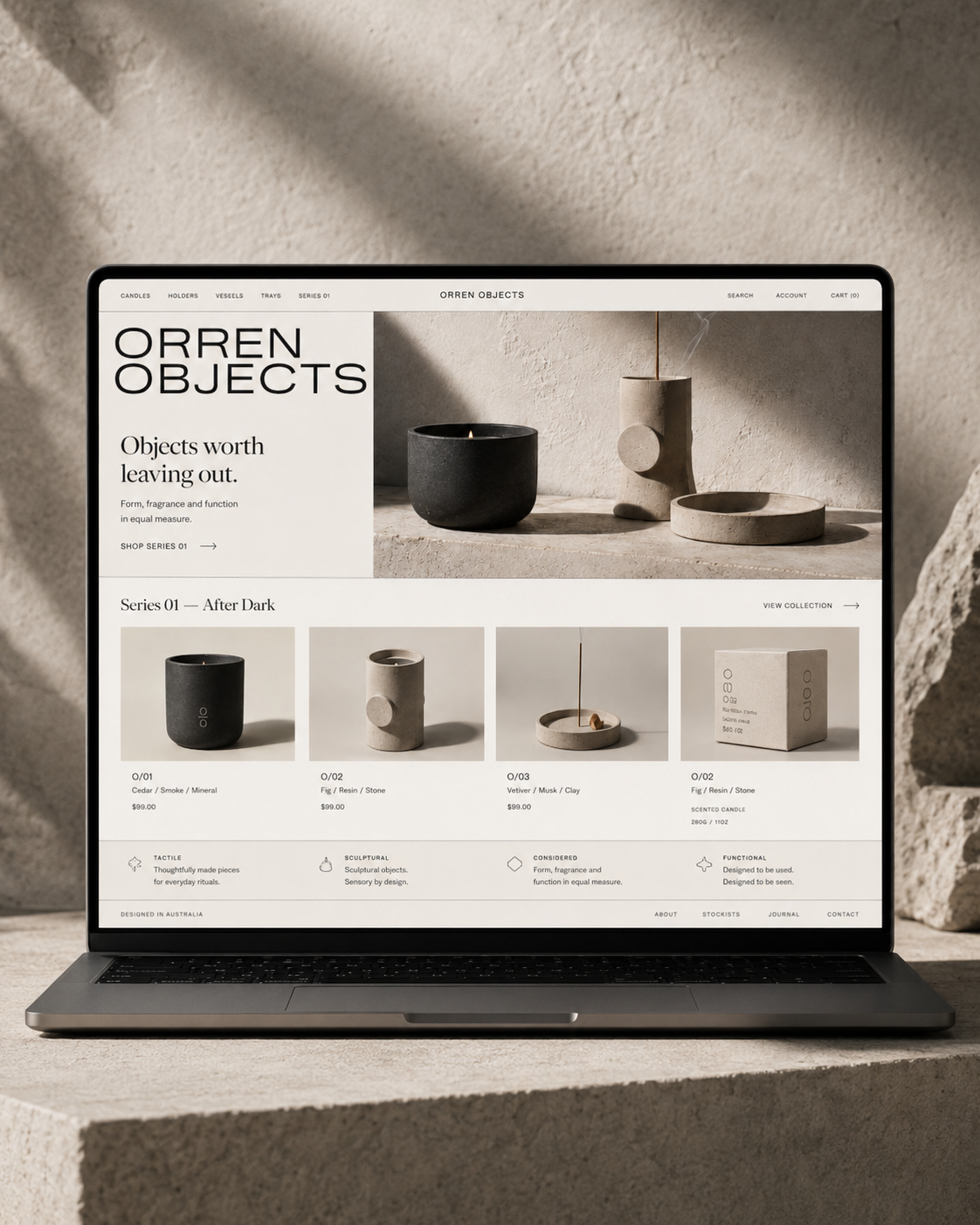
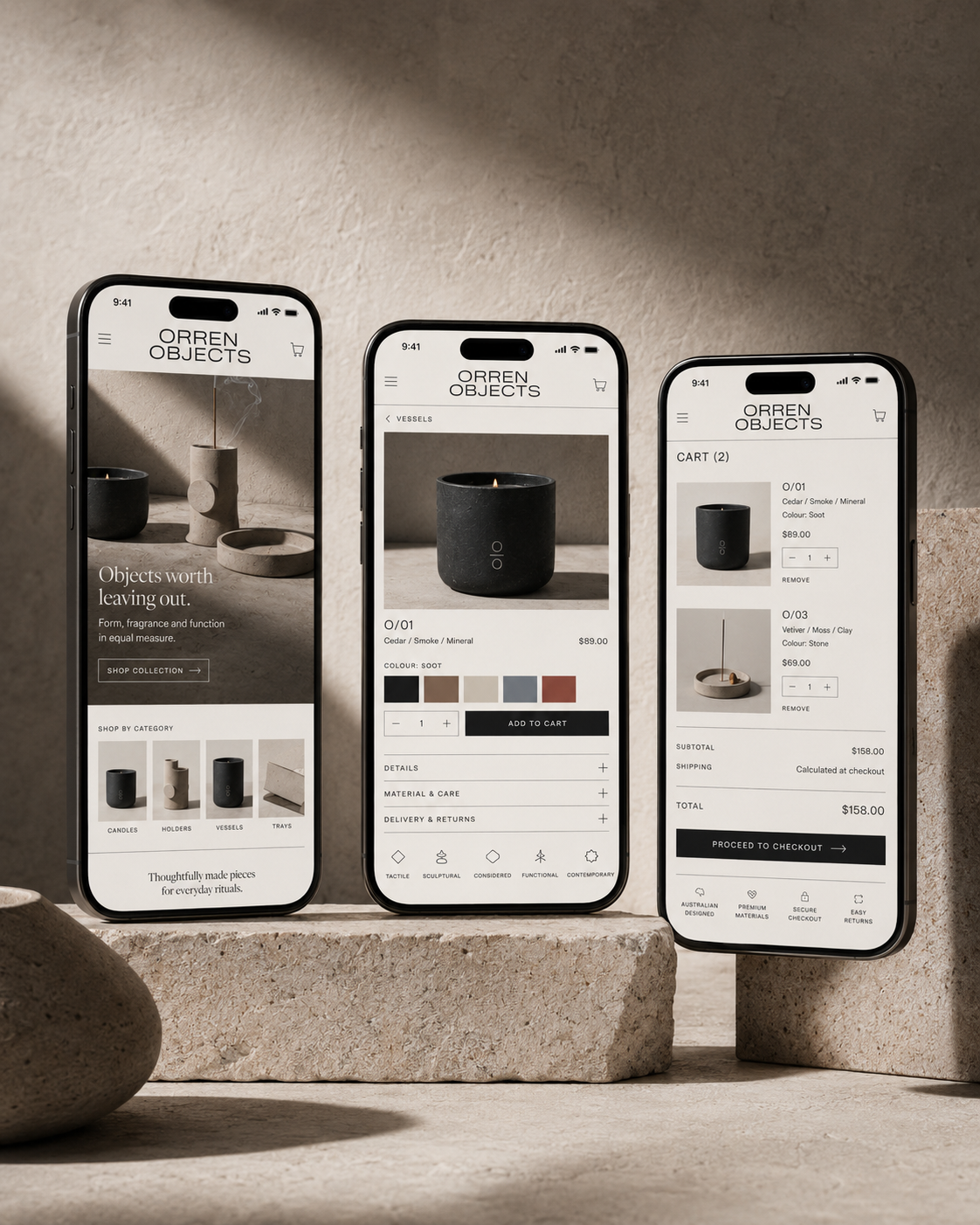
The site was designed to behave more like a digital product catalogue than a conventional promotional store.
The homepage opens with the proposition and introduces the product immediately.
The mobile version was designed as a primary shopping environment, not an afterthought — large imagery, strong brand typography, interaction adapted for touch rather than compressed from the desktop layout.
07 — Packaging and art direction
The object earns the attention.
The packaging behaves like part of the product catalogue rather than a container for it.
Boxes use the same modular notation found on the website. The visual language is intentionally quiet — large areas of uncoated neutral material, black typography, the secondary Orren mark, with clay-red seals providing collection-specific colour.
An ecommerce order feels like one coherent brand experience from checkout to unboxing.
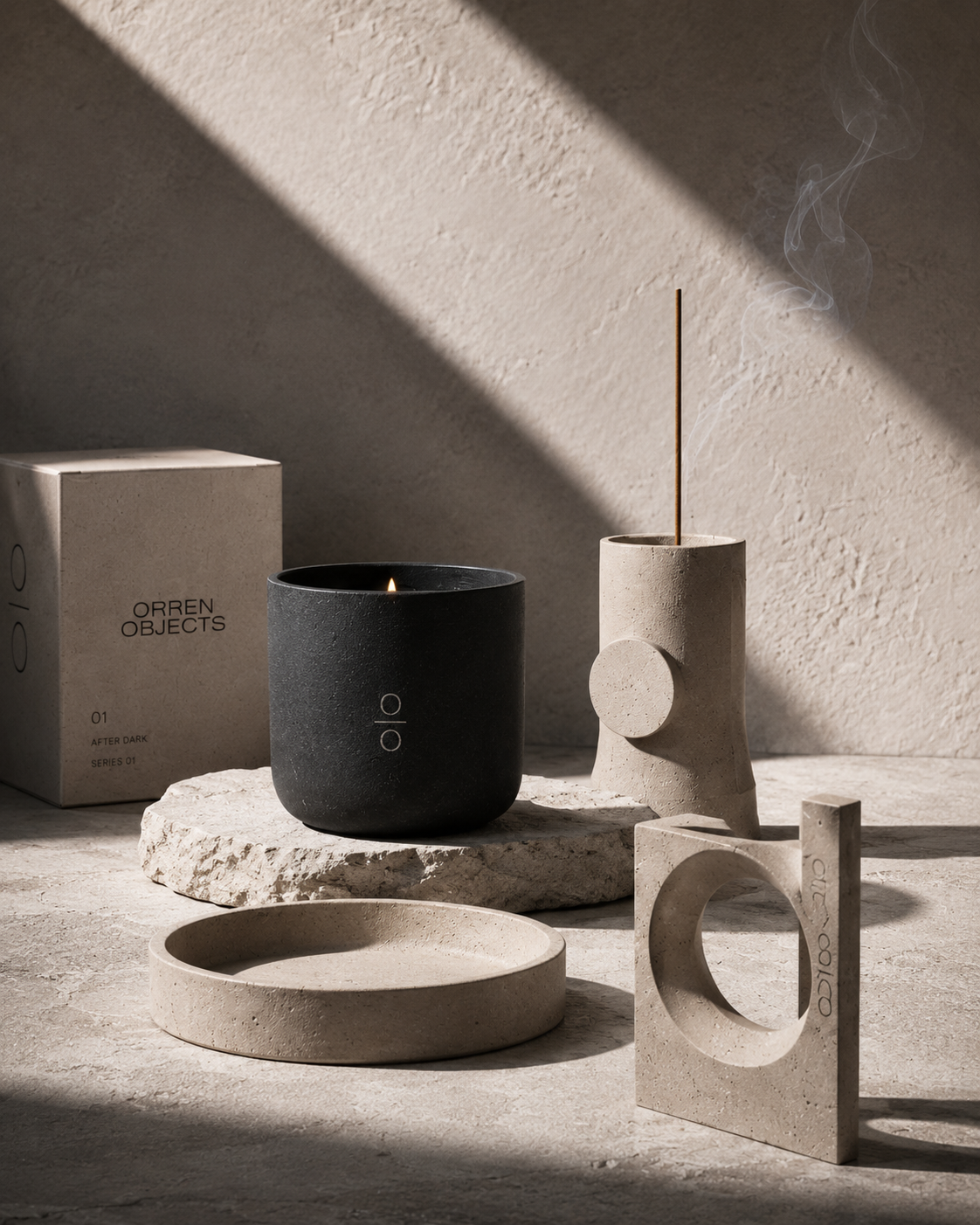
Photography is treated more like industrial or interior design than conventional lifestyle content.
Hard directional light, pronounced shadows, raw architectural surfaces, close material detail and simple geometric compositions allow form and material to lead.
Smoke, flame and shadow add movement without changing the fundamental visual language.
08 — Outcome
A unified commercial system.
No fabricated sales or conversion figures are attached to this project.
The demonstrated outcome is a unified commercial brand system — one where the packaging, website, photography and campaign all come from the same underlying idea.
The defining question behind the project wasn’t how do we make another premium candle brand?
It was: if the object itself is the reason someone buys, how do we make every part of the brand give that object the value and attention it deserves?
Next project
Mara Venn
Expert-led consultancy